


A table of results is produced for each pupil showing progress in each subject.
The important column in the table below is the right-hand column (std. residual). This value shows the progress of the pupil, calculated as the number of standard deviations from the BASE9 cohort average of 0.0. A score close to 0.0 indicates that the pupil kept pace as expected, a positive score indicates better progress than expected and a negative score indicates slower than expected progress.
Progress chart for each pupil
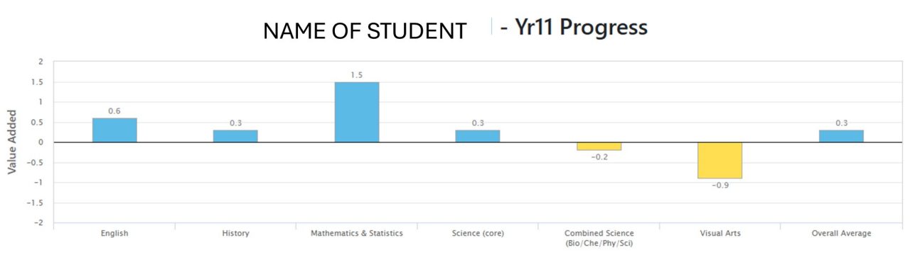
The chart easily identifies whether the pupil had consistent progress across all subjects, or whether progress in one subject differed from the other subjects. Points above the "0.0" line show subjects with positive progress. Points below the line show subjects with slower progress.
The chart depicts the same results as those produced in table form.
Progress per subject graph

The graph for a school shows the line of best fit produced from all BASE pupils. Each line of best fit is specific to the subject. Each circle (point) is a pupil in that particular school.
- On or close to the line: The pupil has kept pace with others of like ability in that subject. He/she will be represented as a point on or close to the line.
- Above the line: The pupil progressed further than others of like ability in that subject. He/she will be represented as a point above the line.
- Below the line: The pupil lagged behind others of like ability in that subject. He/she will be represented as a point below the line.
The feedback is interactive. A pupil's name emerges adjacent to each point when the mouse pointer is placed over a point on the graph.
School (or institution) report

The graph compares the average standardised residual for each subject in the school. The brown outer region indicates the standard error with significance at the second and third confidence levels. Yellow bars indicate negative value added for that subject. Blue bars represent positive value added. A subject bar within the inner region indicates that any difference from the overall BASE score of 0.0 may be due to chance.
Longitudinal SPC chart per subject

The graph shows average subject progress from year to year. There is a different graph given for each subject.
If the school's point is in the inner region, then any difference between this school's subject and the combination of all schools in that subject could be due to chance. If the point is in the brown region or beyond, then the difference between the school and the combination of all schools in the subject is significant.
